Answer the question
In order to leave comments, you need to log in
How to compactly design vertical navigation if the grid doesn't allow it?
Hello.
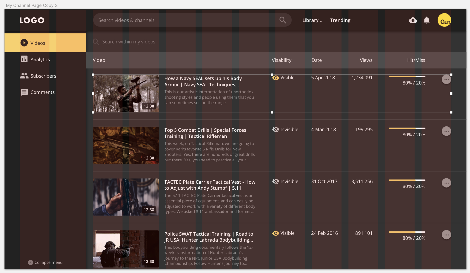
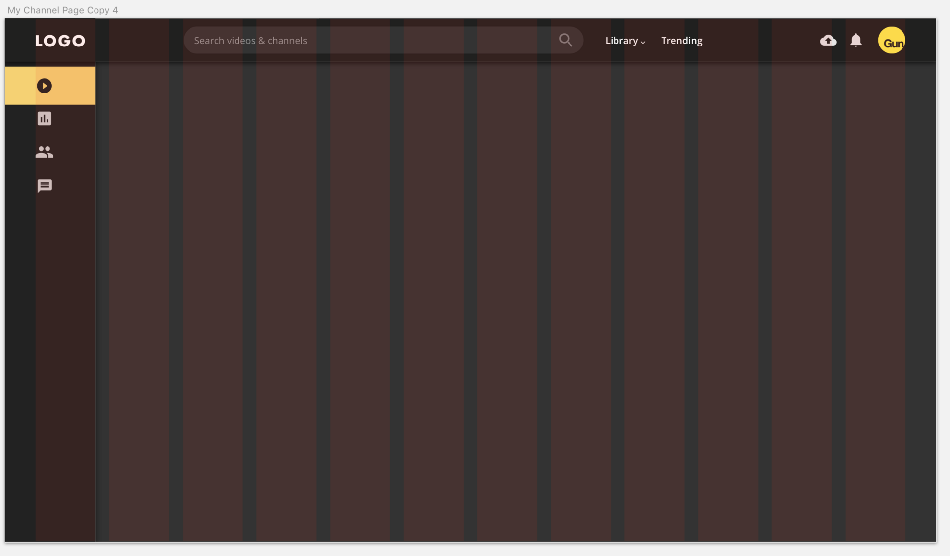
There is a site layout with vertical navigation, which has the ability to collapse (signatures disappear, only icons remain, the container itself becomes
narrower
)
Example http://element.eleme.io/#/en-US/component/menu#collapse When collapsing, I want the navigation to take up as little space as possible (to provide a wider content area. Important when viewing on a mobile or tablet).
How to solve this problem? Change grid on all layouts? Layout with expanded navigation and grid Layout with collapsed navigation and grid Compact navigation example https://dribbble.com/shots/3712350-Adahead-Ad-opti...

Answer the question
In order to leave comments, you need to log in
After talking with the developer, I came to the conclusion that layouts with such markup (sidebar + content part) are better done like this: the sidebar is not included in the grid, and the content part is divided into 12 columns (or 8, 6, 4, depending on the width of the device under which layout is done). Then everything becomes logical. The sidebar does not “eat up” any columns and can be of any size, while the content part lives on with its markup.
Personal example
I hope that I correctly understood the essence of the issue.
Break it down into 24, not 12. Why did you hit exactly 12 columns. Of course, you can't write anything normally in such "thick" columns.
Well, judging by the layout, it is generally not really tied to the grid. Elements easily fall into the gutter, which should not be.
Didn't find what you were looking for?
Ask your questionAsk a Question
731 491 924 answers to any question