Answer the question
In order to leave comments, you need to log in
How to collapse .panel Bootstrap on tablets?
Bootstrap
question . I am using the Panels component.
<div class="row">
  <div class="col-md-4">
    <div class="panel panel-default">
      <div class="panel-heading">Panel title</div>
      <div class="panel-body">Panel content</div>
    </div>
  </div>
  <div class="col-md-4">
    <div class="panel panel-default">
      <div class="panel-heading">Panel title</div>
      <div class="panel-body">Panel content</div>
    </div>
  </div>
  <div class="col-md-4">
    <div class="panel panel-default">
      <div class="panel-heading">Panel title</div>
      <div class="panel-body">Panel content</div>
    </div>
  </div>
</div>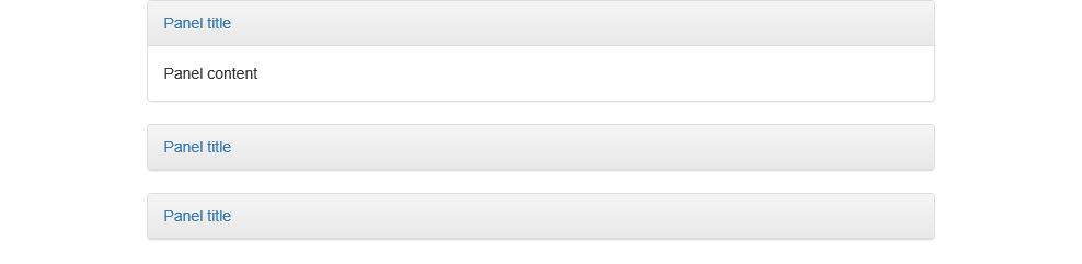
Answer the question
In order to leave comments, you need to log in
Alternatively, panel-bodyadd the class for hidden-xs. And panel-headinghang on
$(this).siblings('.panel-body').toggleClass('hidden-xs')Didn't find what you were looking for?
Ask your questionAsk a Question
731 491 924 answers to any question