Answer the question
In order to leave comments, you need to log in
How to change the responsive setting in WPBakery WordPress?
Good day to all!
Making a website using the WPBakery builder
There was a problem setting columns responsive for "tablets" (I guess I don't know what it is)
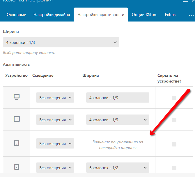
What should I do to be able to select the size of the columns here, and not the "Default value from the width settings"?
Answer the question
In order to leave comments, you need to log in
I didn't understand for a long time either.
Actually, this is where the value from the width settings is taken, which is on top of the adaptability.
Suppose you need to have 6 columns here too, then write 6 columns in the width settings. And on the tablet and desktop, you set it as you need, 4, for example, as it costs. Well, he has a mobile-first grid, that is, where the desktop is, this value will be larger for any screen width than the desktop
Didn't find what you were looking for?
Ask your questionAsk a Question
731 491 924 answers to any question