Answer the question
In order to leave comments, you need to log in
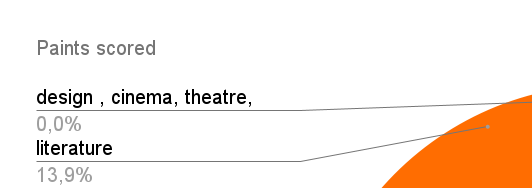
How to change percentage and title color in google sheets chart?
I have created a chart and in it the percentages and the title must be black instead of gray.

Answer the question
In order to leave comments, you need to log in
I guess not. Unfortunately, the charts have remained at a prehistoric level of support. Recent updates seem to offer hope, but still nothing. For example, the API does not support half of the properties. With what it is connected and how to treat - it is not clear. I would recommend setting up the Table and creating charts already in Data Studio , but this is an additional hassle.
Please note that this is a Google Sheets issue and nothing else. By themselves, Google Charts work perfectly.
I've tried probably everything
const mode = chart.modify()
    .asPieChart()
      .asPieChart()
      .setTransposeRowsAndColumns(false)
      .setNumHeaders(1)
      .setOption('bubble.stroke', '#000000')
      .setOption('annotations.domain.textStyle.color', '#808080')
      .setOption('textStyle.color', '#000000')
      .setOption('legend.textStyle.color', '#191919')
      .setOption('pieSliceTextStyle.color', '#000000')
      .setOption('titleTextStyle.color', '#757575')
      .setOption('annotations.total.textStyle.color', '#808080')
.build();Didn't find what you were looking for?
Ask your questionAsk a Question
731 491 924 answers to any question