Answer the question
In order to leave comments, you need to log in
How to adapt part of the site for mobile devices?
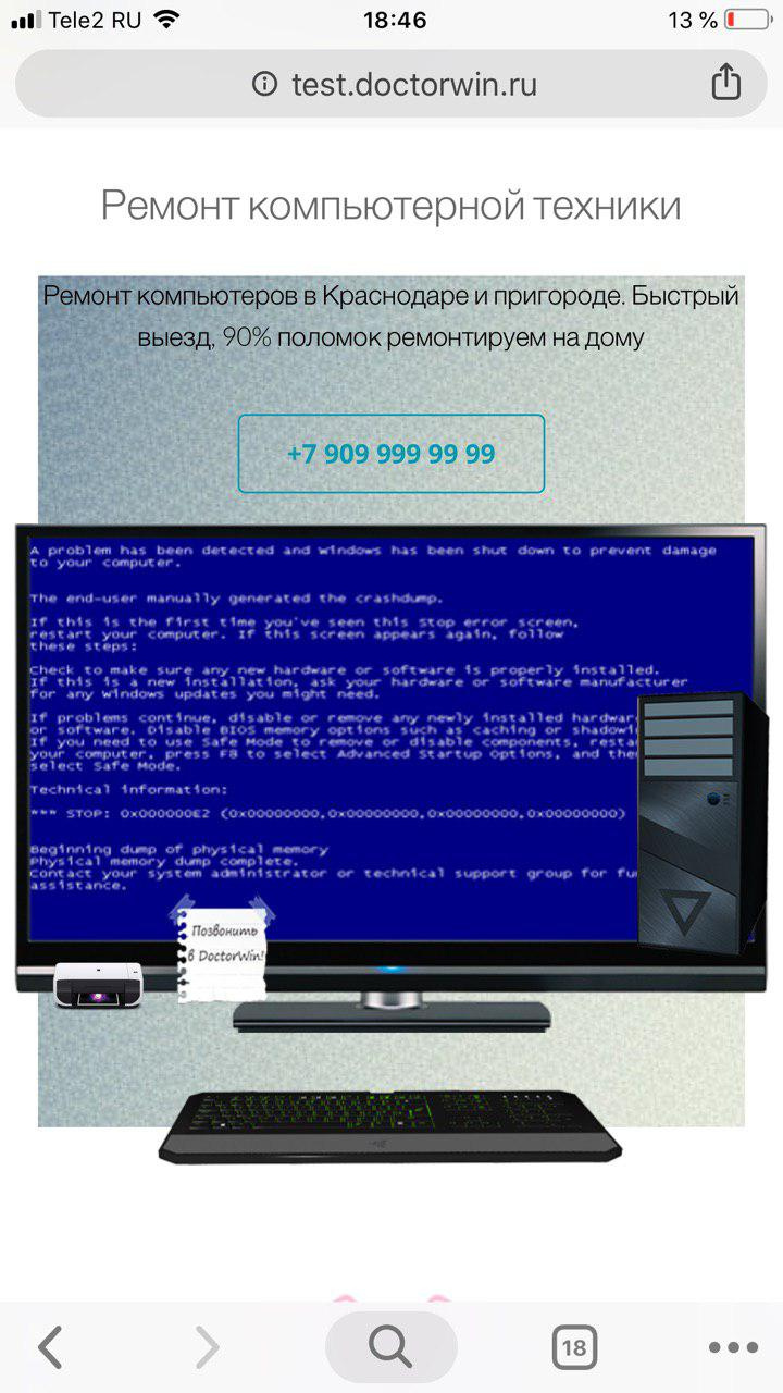
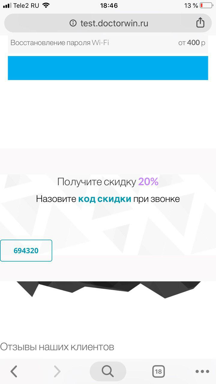
Good day! Can you tell me how to adapt part of the site for mobile devices?
Some parts are displayed correctly, but parts on the screenshots are not.
Website
Is it possible to remove the display of images in the header in the mobile version? Leave only the background and text
And move the discount button in the mob. versions
Answer the question
In order to leave comments, you need to log in
All this is done in css media queries. If you don’t know how to make up websites, and the budget doesn’t allow asking those who know how, or for such a “little thing” and you don’t want to spend at all or some penny, you can search the Internet for information about media queries ( media queries). In your case, you need to write properties for the same picture or block containing this picture at small screen sizes ( mobilecss ) :
.block_img{
    display: none
}@media only screen and (max-width: 768px){
.block_img{
display: none
}
}The quality of thumbnail creation depends on the library that is used. You can also put Photoshop on the server, then the thumbnails will be perfect, but it's expensive in terms of resources. Therefore, if you want perfect miniatures, make them with your hands in Photoshop and replace them.
thumbnail created by wordpress
Didn't find what you were looking for?
Ask your questionAsk a Question
731 491 924 answers to any question