Answer the question
In order to leave comments, you need to log in
How do you indent in responsive component layout?
Good day everyone.
I have long wanted to learn how to properly indent layout using BEM or any other component methodology.
For example, let's take the simplest landing element. For example "pros of the product". 
1. We make a component. (pseudocode)
.Плюс
  .Плюс__иконка
  .Плюс__заголовок
.Плюс__описание.секция секция--наши_плюсы
.ряд
.ряд_конка.ряд_конка--4
.Плюс
.Плюс__иконка
.Плюс__заголовок
.Плюс__описание
.ряд_конка.ряд_конка--4
.Плюс
.Плюс__иконка
.Плюс__заголовок
.Плюс__описание
и т.д.
Answer the question
In order to leave comments, you need to log in
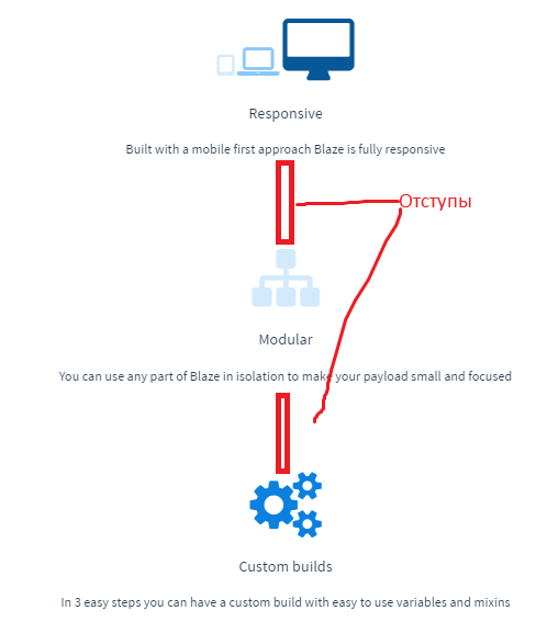
Problems begin when you need to make an adaptive. Between the "pluses" should appear vertical indents.
<div class="grid page__layout">
  <div class="grid__row">
    <div class="grid__col grid__col--xs-12">...</div>
    <div class="grid__col grid__col--xs-12 grid__gap-xs">...</div> // Колонка с оступом для xs
  </div>
</div>here https://jsfiddle.net/kzf3o6sf/4/
Flexbox this solves everything here is the link
Didn't find what you were looking for?
Ask your questionAsk a Question
731 491 924 answers to any question