Answer the question
In order to leave comments, you need to log in
How do I properly position blocks when responsive in bootstrap?
Hey!
Bootstrap 4.6. Newbie at this. I used to do everything with my hands, but I wanted to try BS.
I have such a table with tasks (sandbox - below in Codepen).
|Created|Deadline|Task|Contributors|Status|
________________________________________________________________________________________________
|01.02.03|02.02.03|Drink tea Drink tea Drink tea Drink tea |Vasya, Petya, Masha| + |
________________________________________________________________________________________________
|05.02.03|06.02.03|Drink coffee Drink coffee Drink coffee Drink coffee |Katya, Petya, Kolya| - |
________________________________________________________________________________________________
I want to make the following metamorphosis with a narrow screen width:
|Created|Deadline|Status|
______________________________________________________
|01.02.03|02.02.03|+ |
|Drink tea Drink tea Drink tea Drink tea |
|Vasya, Petya, Masha|
______________________________________________________
|05.02.03|06.02.03|- |
|Drink coffee Drink coffee Drink coffee Drink coffee |
|Katya, Petya, Kolya|
______________________________________________________
Here is an example on CP:
To make it clearer, I'll draw in paint: The
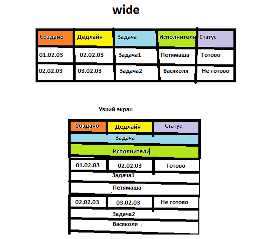
question is:
Is it possible to somehow make the code that is given in the CodePen working for my Wishlist? Or do we need to redo everything in a different direction?
If redoing, then in which direction to look?
Answer the question
In order to leave comments, you need to log in
Didn't find what you were looking for?
Ask your questionAsk a Question
731 491 924 answers to any question