Answer the question
In order to leave comments, you need to log in
How can I make the image shrink evenly from both ends when the screen is reduced?
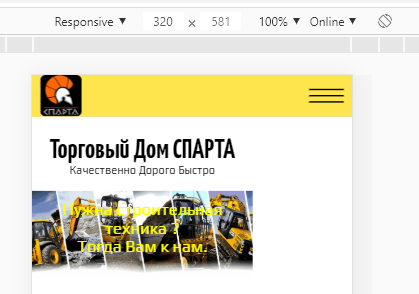
Faced such a problem, when the screen is reduced to 670px, the image decreases evenly. When the screen resolution reaches 670px, the image in the block occupies the entire width of the screen. And when I continue to reduce the screen size, in the code inspector, the picture is already not reduced evenly, but is compressed only from the right side. At first I thought that it did not allow it to occupy the entire width of the menu block, but when I reduced its width, nothing changed. Only the menu block itself has become smaller in width. How can this situation be corrected?
Here are screenshots from the inspector 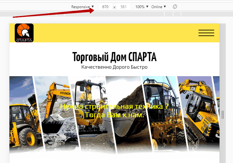
Here is part of the HTML markup 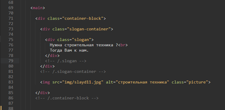
And the styles for the markup above 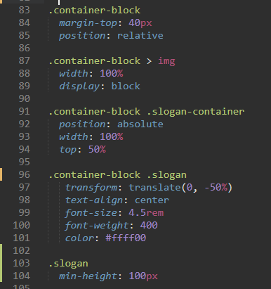
I don’t understand why
Answer the question
In order to leave comments, you need to log in
Didn't find what you were looking for?
Ask your questionAsk a Question
731 491 924 answers to any question