Answer the question
In order to leave comments, you need to log in
How can I make certain elements disappear when the screen is reduced in responsive layout?
Good afternoon,
I need to make a responsive website for 320px and 480px. (layouts in the attachment)
When the layout is increased from 320 to 480px, an advertising banner should appear (the picture on the right with the inscription "Adidas"), when it is reduced to 320px, the banner should disappear accordingly.
Please tell me how to do it.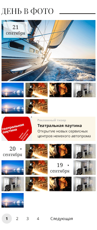

Answer the question
In order to leave comments, you need to log in
dk-web dk-web and matperez matperez , thanks for the response.
i use yes :
media only screen and (max-width: 320px) {
banner (id or class) {
display:none;
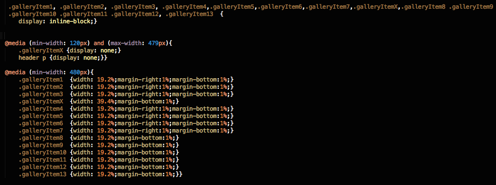
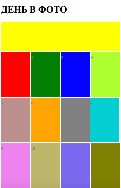
I need to do all this with mobile first. Attached are 2 pictures. The first one is at 320 px. everything is clear there. but when I increase it to 480px, the blocks on the side leave me and there is a white space, because "Adidas" block is high.
Please tell me how to fix the situation, how to fix the code or rewrite. (1st image HTML code, 2nd image CSS file)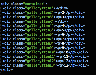

Very simple:
@media only screen and (max-width: 320px) {
     баннер (id или класс) {
      display:none;
  }
}media-queries
will help you . Example from the first link in the search.
<!-- CSS media query on a link element -->
<link rel="stylesheet" media="(max-width: 800px)" href="example.css" />

<!-- CSS media query within a stylesheet -->
<style>
@media (max-width: 600px) {
  .facet_sidebar {
    display: none;
  }
}
</style>Didn't find what you were looking for?
Ask your questionAsk a Question
731 491 924 answers to any question