Answer the question
In order to leave comments, you need to log in
How can I adapt this template?
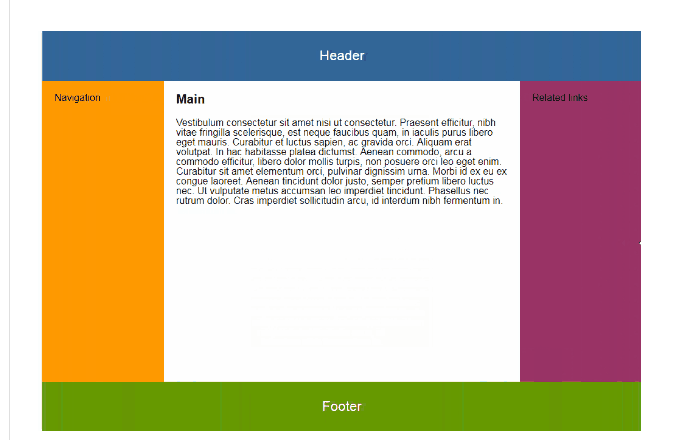
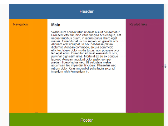
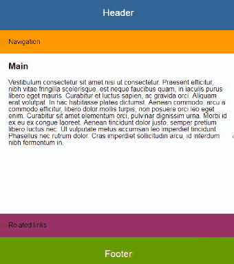
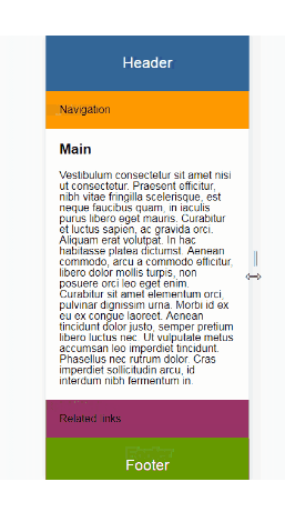
Greetings! I have such a template that I made up, I need to make it adaptive so that it compresses like in the screenshots that are attached below .. How can I do this without using bootstrap? I am attaching screenshots and layout of the template, thanks in advance for the answer!
<!DOCTYPE html>
<html lang="en">
<head>
  <meta charset="utf-8">
  <title>Responsive layout</title>
  <link rel="stylesheet" type="text/css" href="style.css">
  <meta name="viewport" content="width = device - width">

</head>
<body>
  <header>
    <p>Header</p>
  </header>
  <main>
  <div class="left">Navigation</div>
  <div class="center">
    <h1>Main</h1>
    <p>Lorem ipsum dolor sit amet consectetur, adipisicing elit. Numquam nesciunt minus cumque quidem non maiores voluptas, voluptates commodi ipsa eaque rem, illo ipsum deserunt optio repellendus rerum, possimus alias, quos?
    Lorem ipsum dolor sit amet consectetur adipisicing elit. Iste laudantium molestias dicta nemo ab distinctio? Corrupti necessitatibus est, quis error laudantium ad, aspernatur repellendus repudiandae facilis velit delectus corporis ex?</p>
  </div>
<div class="right">Related Links</div>
</main>

<footer class="footer">Footer</footer>


</body>
</html>@import url(nullstyle.css);
header{
width: 100%;
height: 10%;
display: flex;
align-items: center;
justify-content: center;
background-color: #4682B4;
color: #fff;
font-size: 150%;
}
main{
display: flex;
height: 80%;
}
.left{
background-color: #ff9900;
width: 20%;
}
.center{
padding: 2%;
background-color: #fff;
}
.right{
background-color: #800080;
width: 20%;
}
.footer{
background-color: #339900;
height: 10%;
color: #fff;
font-size: 150%;
display: flex;
align-items: center;
justify-content: center;
}Answer the question
In order to leave comments, you need to log in
@media (max-width: 767px) {
  main {
    flex-flow: column nowrap;
    height: auto;
  }
  .left, .center, .right {
    width: 100%;
  }
}Didn't find what you were looking for?
Ask your questionAsk a Question
731 491 924 answers to any question