Answer the question
In order to leave comments, you need to log in
Grids in addition to 12-column Bootstrap, how to be?
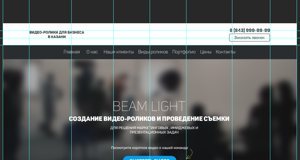
Good evening of the day, gentlemen. I need your help, I wanted to ask how to build a grid when it is not standard, for example, like this: 
Or is it already necessary to build by eye?)
And what to do if the dimensions are set strangely, for example, the width of the container here is 1920px; of course I can scale it down to the standard 1200px; but then all the elements will have to be scaled down relative to the reduced size of the container.
How to learn to feel all the subtleties? Where to see?
Answer the question
In order to leave comments, you need to log in
https://getbootstrap.com/docs/3.3/customize/
The official website of Bootstrap has a tool to customize the build. Here you can adjust at least the number of columns, at least the width of the container.
Hm. Was it possible to negotiate with the designer? (Next time, give us your lined psd) Does the
customer want a pixel-by-pixel layout? (then hell, suffering and crutches)
If not, stick to the approximate location and do not bathe.
Or migrate to 4.
Everything fits into the grid well here, for example:
- the top header - 2 columns, col-md-6 (the right column has text-align:right;, that is, the text-right class)
- menu col-md-12
- the inscription on the banner col-md-12
below may well be rows with 3 and 4 columns
Didn't find what you were looking for?
Ask your questionAsk a Question
731 491 924 answers to any question