Answer the question
In order to leave comments, you need to log in
Float how to flip upside down?
Hello, I am new to everything (fixed layout, adaptive, semantic, etc.).
I am making my modest site (adaptive, etc.)
There was a small problem, I would not want to resort to possible crutches.
We want the number text and the small menu to both visually fit the edge of the screen between 968px and 1280px wide, which was done by using float:right on the menu, but it flipped. Home should be first, portfolio second, and so on.
How to painlessly save the current result of pressing to the edge and return the correct menu order?
PS 100% Solution
" Dmitry Novikov @dmitriy_novikov
I've been doing
web development since 2010.
Remove the "float:right" property from .container-main-style and add "text-align:right" to the header nav. And that's all.
After all, you use inline-block, why do you need this wrapping."
And my little fix: "Up to 968px c text-align:right; the menu became a bit ugly, but applying text-align:justify; in the media (max-width:968px) header nav fixed everything!"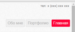
<header>
            <div class="head__img">
                <img src="img/Logo.png" alt="logo">
            </div>
            <div class="head__number-phone">
            	<div>тел: x (xxx) xxx xxx</div>
            </div>
            <nav>
                	<a class="container-main-style" href="index.html">Главная</a>
                    <a class="container-main-style" href="portfolio.html">Портфолио</a>
                    <a class="container-main-style" href="about.html">Обо мне</a>
            </nav>
</header>header{
width:100%;
height:120px;
display:inline-block;
}
.head__img{
width:50%;
padding-left:3.5%;
padding-top:20px;
display:inline-block;
}
@media (max-width:968px){
.head__img{
width:10%;
float:left;
margin-top:25px;
}
}
.head__number-phone{
float:right;
width:30%;
}
@media (max-width:968px){
.head__number-phone{
float:left;
width:65%;
}
}
@media (max-width:968px){
.head__number-phone{
margin-left:-37%;
}
}
.head__number-phone div{
color:#666666;
font-size:13px;
padding-top:5px;
float:right;
margin-right:3%;
}
@media (max-width:968px){
.head__number-phone div{
padding-left:41%;
font-size:11px;
float:none;
}
}
header nav{
width:30%;
float:right;
padding-top:0px;
margin:0;
padding:0px;
text-decoration:none;
}
@media (max-width:968px){
header nav{
width:97px;
margin-top:-5px;
padding-left:26%;
position:relative;
}
}
@media (min-width:1280px){
header nav{
width:30%;
}
}
header nav A:hover{
background-color:#FF0238;
border:1px solid #FF0238;
color:white;
}
header nav A:nth-child(1){
background-color:#FF0238;
border:1px solid #FF0238;
color:white;
}
.container-main-style{
display:inline-block;
float:right;
margin-right:2%;
border:1px solid #efefef;
border-radius:3px;
padding:6px;
color:#aeaeae;
background-color:#efefef;
box-shadow: 0 0 1px rgba(0,0,0,0.4);
}
@media (max-width:968px){
.container-main-style{
display:block;
margin-top:10px;
float:none;
}
}Answer the question
In order to leave comments, you need to log in
Remove the " float:right " property from .container-main-style , and add " text-align:right " to the header nav . And that's all.
After all, you use inline-block, why do you need this wrapping.
Didn't find what you were looking for?
Ask your questionAsk a Question
731 491 924 answers to any question