Answer the question
In order to leave comments, you need to log in
Excel. How to make a combo chart with grouping?
Hello. Stumbled like a banal task. It is necessary to draw resource consumption (plan / fact) for several topics in the context of months in one diagram.
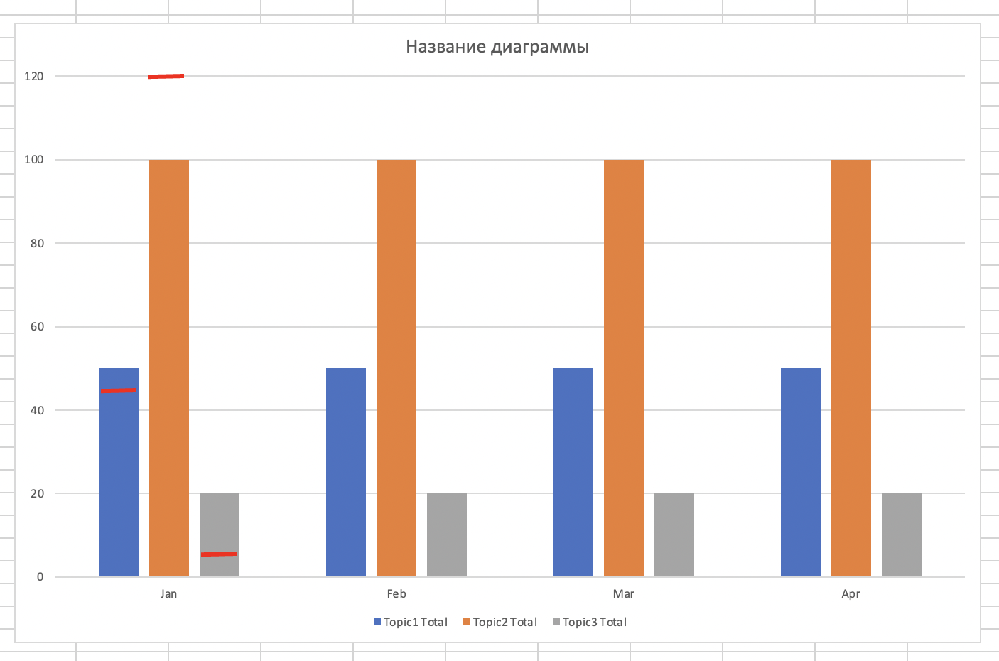
If there are no problems with displaying the fact - an ordinary histogram with grouping, then the plan display (cutoff line / stack) does not work out - I don’t understand how to build a diagram correctly.
I attached an example of the initial data and what I get now, manually drawing the plan values. Perhaps you have solved such a problem and know how to do it right? The goal is to fill in only the data, without manually drawing the values.
Help with this task, please.
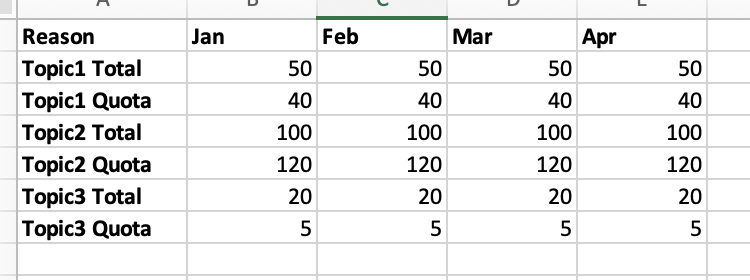
Data
Completed histogram (on the example of January)
Answer the question
In order to leave comments, you need to log in
Didn't find what you were looking for?
Ask your questionAsk a Question
731 491 924 answers to any question