Answer the question
In order to leave comments, you need to log in
Div blocks on screen shrink?
Good afternoon!
there is a header code for 3 blocks (logo, address, contacts)
when the screen shrinks, I mean ~ 490px, the widths of the blocks begin to shrink, but how to make them go under each other, and the content will be centered. Or at least if they do not fit in width, so that they begin to fold under each other. 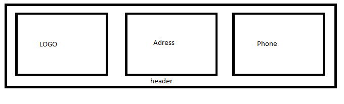
like this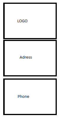
<div class="column-left">
<a href="#"><img src="#LOGO" width="130px" height="130px"></a>
</div>

<div class="column-center">
<b>Наш адрес:</b><br>
Московская область<br>
</div>

 <div class="column-right">
    <b>Звоните:</b>
    <a href="tel:+74999999999">8(499)999-99-99</a><br>
    <a href="tel:+79888888888">8(988)888-88-88</a>
</div>Answer the question
In order to leave comments, you need to log in
Use media queries. For example:
@media (max-width: 490px) {
  .column-left, .column-center, .column-right{
    width: 100%;
  }
}Didn't find what you were looking for?
Ask your questionAsk a Question
731 491 924 answers to any question