Answer the question
In order to leave comments, you need to log in
Criticism, criticism. Beginner in front-end development. Am I doing everything right?
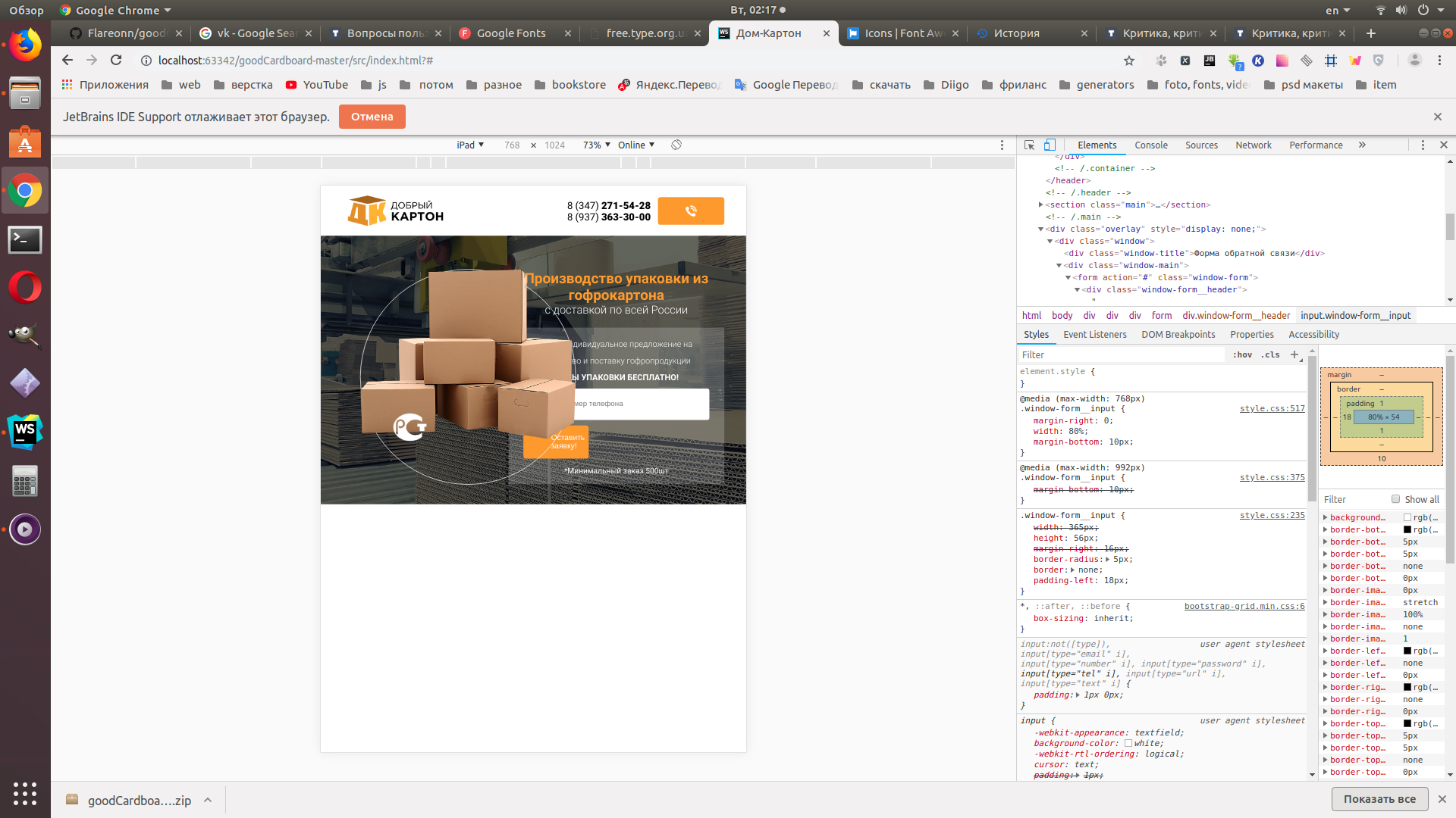
I bought a course at the Academy of Layout, the teacher (Artem Islamov) explains everything in detail and seems to be clear. But the curator was not allocated for homework assignments (These are the conditions of the course).
There is not a single person in my environment who is interested in web development. What is there ... directions with an emphasis on computer science (if I may say so). Sometimes I want to talk with someone about my small, but successes. Or take on some mini-project in order to gain experience.
I am attaching a link to github, with my code:
And here I am on the task of adaptive layout. I dug with her for about 3 days, in short - a crutch on a crutch. I really need your code criticism. Preferably with direct inserts of mine and pieces of yours corrected, with explanations. To whom it is not difficult, I will be extremely grateful to you.
I am also very interested in where I did not google - I found old and dead web developer community forums. If you are familiar with live specimens, could you share a link to them? These are forums where you can communicate with each other.
Answer the question
In order to leave comments, you need to log in
1. The logo should be a link and lead to the main page.
2.
you don't have an inputa with id="phone"
3. usually pictures like on the "request a call" button are an icon font. Have you looked at fontello.com/, https://fontawesome.com/ and others?
4. don't forget to check your code on the validator: https://validator.w3.org/
5. I think you need to put
.header, .main
 min-width: 285px
Didn't find what you were looking for?
Ask your questionAsk a Question
731 491 924 answers to any question