Answer the question
In order to leave comments, you need to log in
Can you help identifying a bug in browser emulators?
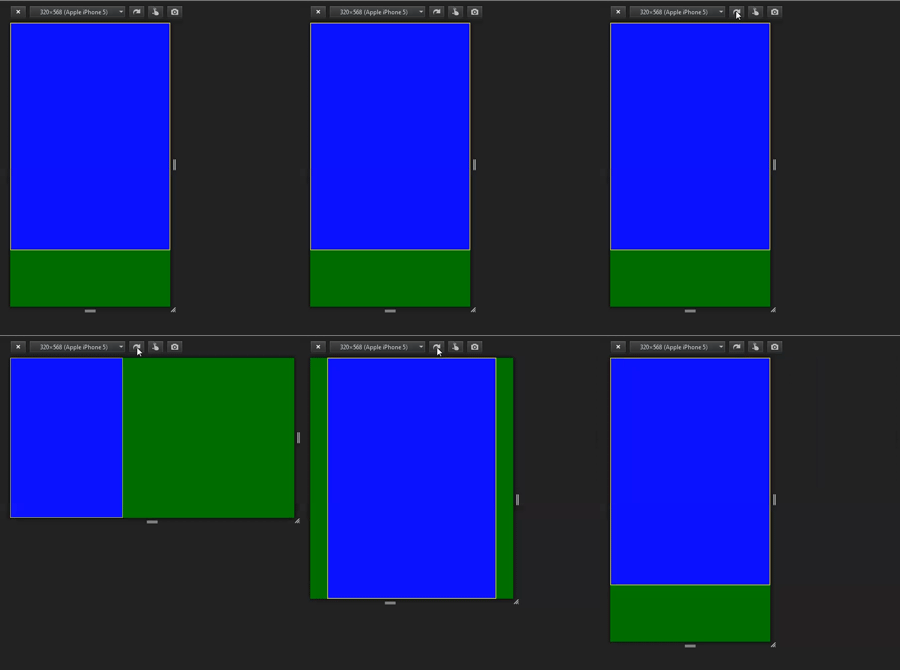
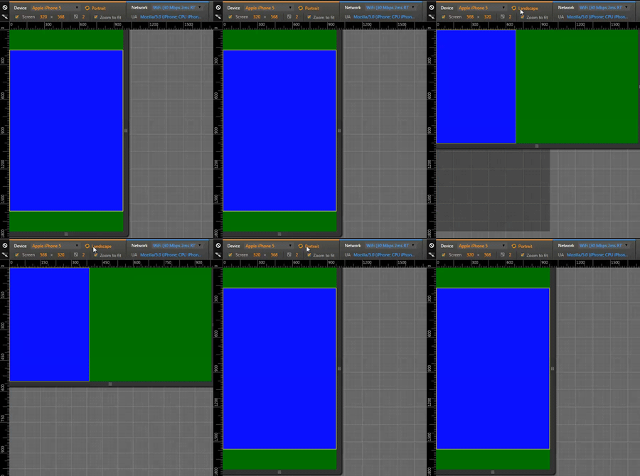
Below are two pictures, the first shows the emulator in FireFox, the second in Google Chrome.
As you can see, the work of the same code is different. 

I don’t have an iPhone, so I would be very grateful if the happy owner of an apple phone could open the code below in it and tell me how it is displayed on a real device.
<!DOCTYPE html>
<html lang="en">
<head>
  <meta charset="UTF-8">
  <title>i-test</title>
  <style>
    body {
      background: green;
    }
    * {
      margin: 0;
      padding: 0;
    }
    .main-container {
      width: 100vw;
      height: 100vh;
      max-width: 100%;
      margin-left: auto;
      margin-right: auto; }
      .main-container:after {
        content: " ";
        display: block;
        clear: both; }

    @media (min-width: 320px) {
      .cover-container {
        width: 100%;
        height: 100%;
        background-image: url(image.png);
        background-size: contain;
        background-repeat: no-repeat;
        background-position: top; } }

    @media (min-width: 568px) {
      .cover-container {
        width: 100%;
        height: 100%;
        background-image: url(image.png);
        background-size: contain;
        background-repeat: no-repeat;
        background-position: left; } }
  </style>
</head>
<body>
  <div class="main-container">
    <div class="cover-container"></div>
  </div>
</body>
</html>
Answer the question
In order to leave comments, you need to log in
You only have one dimension in background-position, but you need two (x and y). Firefox and webkit think out in their own way, that's why there are differences.
Replace with background-position: 0 0, or with background-position: left top, or whatever you need
upd: since safari is on a webkit, it displays like chrome: tyk
Didn't find what you were looking for?
Ask your questionAsk a Question
731 491 924 answers to any question