Answer the question
In order to leave comments, you need to log in
Can't figure out the Bootstrap grid?
Hello!
Trying to figure out the Bootstrap grid, I found a table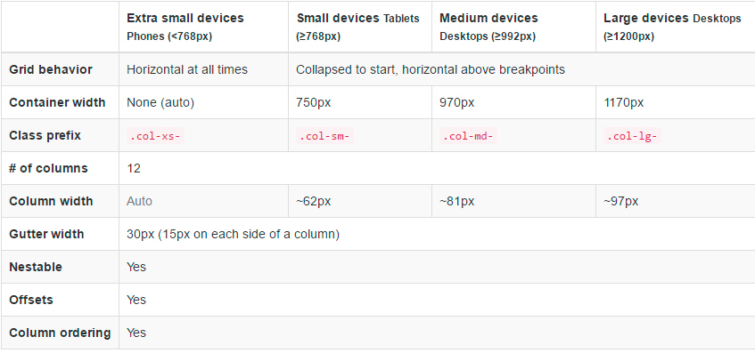 on which I had questions.
If I understand correctly, then the value of 750px (for a screen larger than 768px) is the total width of the columns and the padding between them. But when I started to calculate this width, I came to a complete dead end.
Take for example a screen size greater than 768px. The grid consists of 12 columns of 62px, that is, 12 counts. × 62px = 744px (column widths) .
The table indicates the size of the indents between the columns - 30px. We should have 11 of them. Multiply by 30px and get 330px (padding width between columns)
744px + 330px = 1074px. That's not counting the +2 padding on the sides of the container.
Where did I go wrong? Is 750px the total width of padding and columns?
____________________________________________________________________________________________________________________
PS: I figured out the topic. Finally, an example of using Bootstrap grid helped in this (maybe someone will come in handy).
Answer the question
In order to leave comments, you need to log in
Didn't find what you were looking for?
Ask your questionAsk a Question
731 491 924 answers to any question