Answer the question
In order to leave comments, you need to log in
Bootstrap columns slide down at the same dimension. Why?
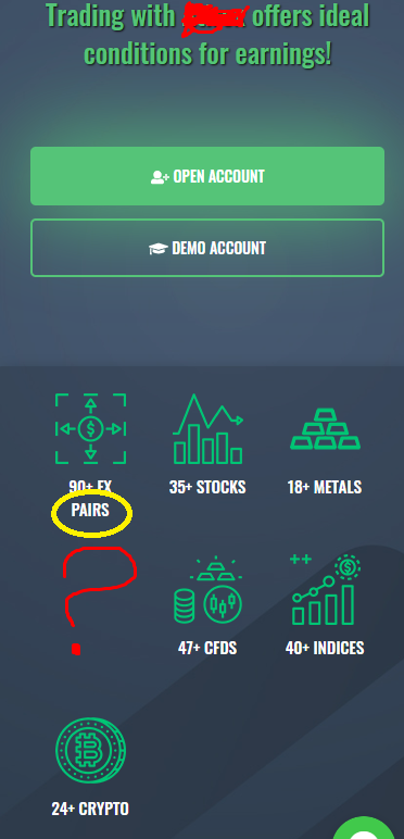
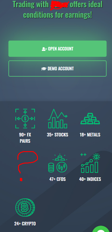
Good afternoon. There is a block on the bootstrap of the following form:
<div class="container view">
      <div class="row">
        <div class="block-01-benefits">
          <div class="col-lg-12 col-md-12 col-xs-12 col-sm-12">
            <div class="row">
              <div class="col-lg-2 col-md-4 col-xs-4 col-sm-4">
                <div class="bright">
                  <img src="https://site.com/images/icons/new/fx-pairs.png" class="img-responsive head-ic">
                  <p>90+ Fx pairs</p>
                </div>
              </div>

              <div class="col-lg-2 col-md-4 col-xs-4 col-sm-4">
                <div class="bright">
                  <img src="https://site.com/images/icons/new/fx-pairs.png" class="img-responsive head-ic">
                  <p>35+ Stocks</p>
                </div>
              </div>

              <div class="col-lg-2 col-md-4 col-xs-4 col-sm-4">
                <div class="bright">
                  <img src="https://site.com/images/icons/new/fx-pairs.png" class="img-responsive head-ic">
                  <p>18+ Metals</p>
                </div>
              </div>

              <div class="col-lg-2 col-md-4 col-xs-4 col-sm-4">
                <div class="bright">
                  <img src=src="https://site.com/images/icons/new/fx-pairs.png" class="img-responsive head-ic">
                  <p>47+ CFDs</p>
                </div>
              </div>

              <div class="col-lg-2 col-md-4 col-xs-4 col-sm-4">
                <div class="bright">
                  <img src="https://site.com/images/icons/new/fx-pairs.png" class="img-responsive head-ic">
                  <p>40+ Indices</p>
                </div>
              </div>

              <div class="col-lg-2 col-md-4 col-xs-4 col-sm-4">
                <div class="bright">
                  <img src="https://site.com/images/icons/new/fx-pairs.png" class="img-responsive head-ic">
                  <p>24+ Crypto</p>
                </div>
              </div>

            </div>
          </div>
        </div>
      </div>
</div>.col. BUT. For some reason, at a certain screen width, some columns move down to the next line, as if they do not have enough space in the line. To begin with, I will demonstrate how everything looks (almost at any screen extension, everything is OK, but in some ranges of width, the columns move down a line) 


Answer the question
In order to leave comments, you need to log in
Didn't find what you were looking for?
Ask your questionAsk a Question
731 491 924 answers to any question