R
R
Rafik Boh2020-12-17 16:50:40
Design
Rafik Boh, 2020-12-17 16:50:40

Are there any flaws in this site layout?
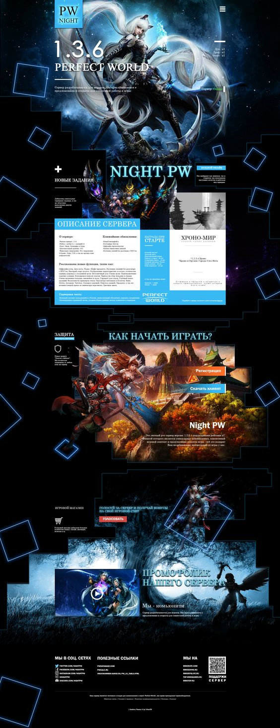
5fdb626c001c9558279813.jpeg

I removed the bottles and coffee far away and took it upon myself to create a full-fledged website layout for the Perfect World game server.
In this work, I tried to draw attention to the many comments left by you on my past works.
I created it for 30 hours, corrected it a lot, turned it upside down and as a result, looking at this layout, I no longer know what to fix to improve the visualization or any gross errors, due to my little experience in this matter.

I would like to hear from you shortcomings in this work, what to pay attention to in order not to step on a rake in the future, both in typography, design and in structuring the site itself. If you like the work, let me know too.

I also uploaded a video to YouTube, where you can view the layout in detail.
https://www.youtube.com/watch?v=7OgQyCE3ijc&featur...

Answer the question

In order to leave comments, you need to log in

2 answer(s)
I
Ivan Bogachev, 2020-12-17
@Mudia

  • White on light is not readable. White in motley - even more so. Blue on blue - oh...
  • Strange mix of serif and sans-serif fonts. There is no system in this. What problem this difference solves is not clear.
  • A lot of different font sizes and letter spacing. The problem is the same - there is no system.
  • The gaps are different everywhere. There are none below. The problem is the same.
  • Information mixed up in places. Eyes run wide. The idea of ​​per-screen scrolling, or something like that, is clearly visible here, but it is worth considering that each screen be about one thing. The first one is about what it is (why are there any characteristics about experience and spirits?), then a description of the server (why is there advertising on the right?), the store generally hid in a bunch of random facts around the edges, I didn’t even notice it the first time .
  • It's not entirely clear how this should adapt to different screen sizes.

In general, you can dig into a lot of things, it makes no sense to list, but the general message is this:
  1. Pay attention to the system in design. Google what a design system is and why simplicity and consistency are good.
  2. Think more about accessibility and adaptability. You design for the user first. A colorful picture is secondary.
  3. No need to pile everything up like in the newspaper. This very rarely works. Control the attention of users, do not let it spread in all directions.

PS: Also, in such projects, you always need to be ready for a dialogue with the developer and avoid pixel-perfect requirements for layouts agreed without it. It's not that hard to make, but these things around the edges with lines and cubes will be generated on the fly (for adaptability). They will not be 100% consistent with what is drawn. Also here it begs to animate all these pictures, as on the current mtg site . I don't know what this style is called, but WebGL is our everything. Yes, and I would make these cubes slowly floating more or less down with swaying and turning ... But this is the next step. The first is the system in design and accessibility.

E
Evgeny Golubev, 2020-12-23
@bestowhope

1. The shadows of the text in the 1st block are needed - otherwise white on white will not be read, that's right. BUT . They are too rough. Make them softer. Example
2. The layout should not be posted on YouTube, but as a picture. Nobody will steal from you.
3. Use no more than 3 styles of one font.
4. White text on blue is readable, but if the blue is brighter - no longer. So it's 50/50 right now. Black on blue is definitely not an option. You did it right in color, but make the blue a little darker.
5. The question "How to start playing" does not actually give an answer.
-Registration (still understandable)
-Client (and what?)
Register. Download the game client. Download the game. run-game
6. The game store is lost somewhere in the pizde black background
7. "Promo video" - the same with shadows.
8. In the last icon block:
a. A different style is unacceptable. Download a set of social media icons if you don't know how to draw yourself.
b. Add some distance between them. Everything on the site should have proper indentation.

Didn't find what you were looking for?

Ask your question

Ask a Question

731 491 924 answers to any question