Answer the question
In order to leave comments, you need to log in
Aligning form elements in Bootstrap?
How to align the form elements (checkbox with an image) so that they are arranged in several rows one below the other (i.e. they are of the same width), while the number of elements would vary depending on the width of the screen?
Now I'm using this code (bootstrap 4.1):
<div class="col">
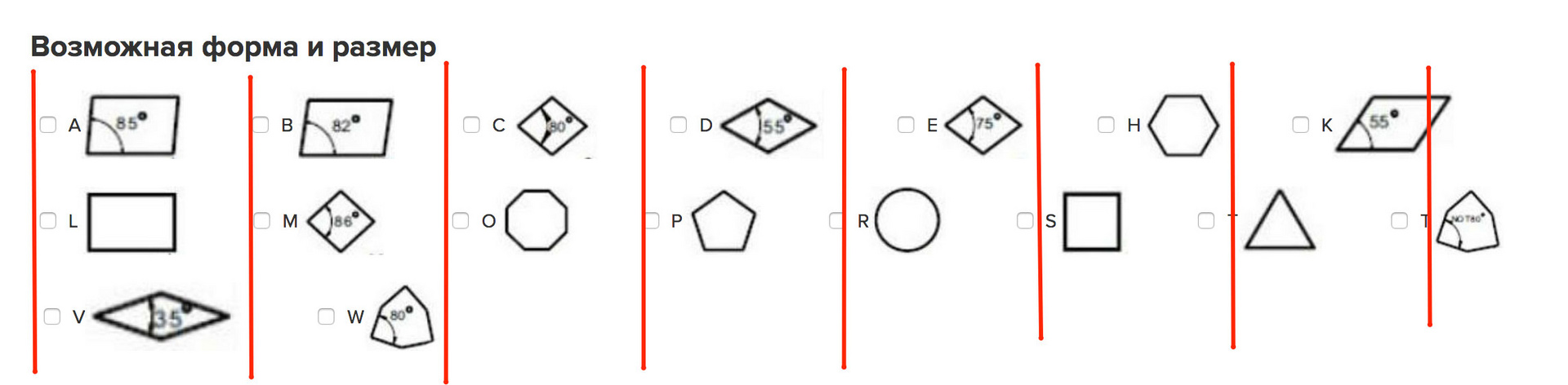
<h2>Возможная форма и размер</h2>
<div class="row">
<form class="form-inline">
<div class="col-auto">
<div class="form-check" id="shape_and_size">
<input class="form-check-input" type="checkbox" id="inlineCheck">
<label class="form-check-label" for="inlineCheck">A</label>
<img src="content/images/shapes_of_plates/A.jpg" height="50px">
</div>
</div>
<div class="col-auto">
<div class="form-check" id="shape_and_size">
<input class="form-check-input" type="checkbox" id="inlineCheck">
<label class="form-check-label" for="inlineCheck">B</label>
<img src="content/images/shapes_of_plates/B.jpg" height="50px">
</div>
</div>
...
Answer the question
In order to leave comments, you need to log in
Didn't find what you were looking for?
Ask your questionAsk a Question
731 491 924 answers to any question