Answer the question
In order to leave comments, you need to log in
Align block to full screen without scrolling?
Layout:
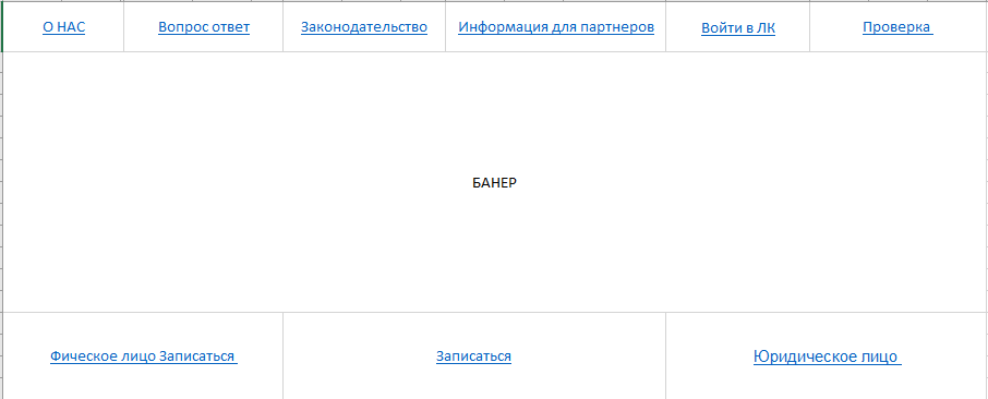
How to center the banner so that it occupies the middle of the block. The block should be visible in full screen without horizontal scrolling.
<!DOCTYPE html>
<html lang="ru">

<head>
  <meta charset="utf-8">
  <title>Портал </title>
  <meta name="viewport" content="width=device-width, initial-scale=1.0">
    <link rel="stylesheet" href="https://cdn.jsdelivr.net/npm/[email protected]/dist/css/bootstrap.min.css" integrity="sha384-TX8t27EcRE3e/ihU7zmQxVncDAy5uIKz4rEkgIXeMed4M0jlfIDPvg6uqKI2xXr2" crossorigin="anonymous">
  <link href='https://cdn.jsdelivr.net/npm/@fortawesome/[email protected]/css/all.css' rel='stylesheet'>
    <link rel="stylesheet" href="{% static '/bootstrap-icons/font/bootstrap-icons.css' %}">
</head>

<body>

<header>
    <nav class="navbar navbar-expand-lg navbar-dark bg-dark shadow">
        <div class="container-fluid px-5">
            <a class="navbar-brand" href="#">Портал</a>
            <div id="geonow"></div>
            <button class="navbar-toggler" type="button" data-bs-toggle="collapse" data-bs-target="#navbarSupportedContent" aria-controls="navbarSupportedContent" aria-expanded="false" aria-label="Toggle navigation">
                <span class="navbar-toggler-icon"></span>
            </button>
            <div class="collapse navbar-collapse flex-grow-0" id="navbarSupportedContent">
                <ul class="navbar-nav me-auto mb-2 mb-lg-0">
                    <li class="nav-item">
                        <a class="nav-link" aria-current="page" href="#">О нас</a>
                    </li>
                    <li class="nav-item">
                        <a class="nav-link" aria-current="page" href="#">Вопрос-ответ</a>
                    </li>
                    <li class="nav-item">
                        <a class="nav-link" aria-current="page" href="#">Законодательство</a>
                    </li>
                    <li class="nav-item">
                        <a class="nav-link" aria-current="page" href="#">Для партнеров</a>
                    </li>
                    <li class="nav-item">
                        <a class="nav-link" aria-current="page" href="#">Проверка</a>
                    </li>
                </ul>
            </div>
        </div>
    </nav>
</header>

<section class="row">
    <div class="col-12">
        <img src="img/banner.jpg" alt="banner">
        <div class="btn-group" role="group">
            <button class="btn">Регистрация компании</button>
            <button class="btn">Записаться</button>
            <button class="btn">Регистрация клиента</button>
        </div>
    </div>
</section>

<script src="{% static 'libs/jQuery/jquery-3.5.1.min.js' %}"></script>
<script src="https://cdn.jsdelivr.net/npm/[email protected]/dist/umd/popper.min.js" integrity="sha384-9/reFTGAW83EW2RDu2S0VKaIzap3H66lZH81PoYlFhbGU+6BZp6G7niu735Sk7lN" crossorigin="anonymous"></script>
<script src="https://cdn.jsdelivr.net/npm/bootstra[email protected]/dist/js/bootstrap.min.js" integrity="sha384-w1Q4orYjBQndcko6MimVbzY0tgp4pWB4lZ7lr30WKz0vr/aWKhXdBNmNb5D92v7s" crossorigin="anonymous"></script>

</body>
</html>
Answer the question
In order to leave comments, you need to log in
If the banner is an image (img tag), then so that it definitely does not climb out of the borders of the parent block, add the img-fluid class to it if bootstrap 4 or 5, or the img-responsive class. For center alignment on the x-axis, you can use a combination of the mx-auto and d-block classes on the img tag. Either d-flex+align-items-center+justify-content-center on the parent is fine for bootstrap 4 and 5, but this will center all boxes inside the parent. You can also use absolute positioning. And in such matters, existing styles are important.
Didn't find what you were looking for?
Ask your questionAsk a Question
731 491 924 answers to any question