Answer the question
In order to leave comments, you need to log in
Adaptive layout. Need help. Why is it displayed differently on the phone than in the browser from the PC?
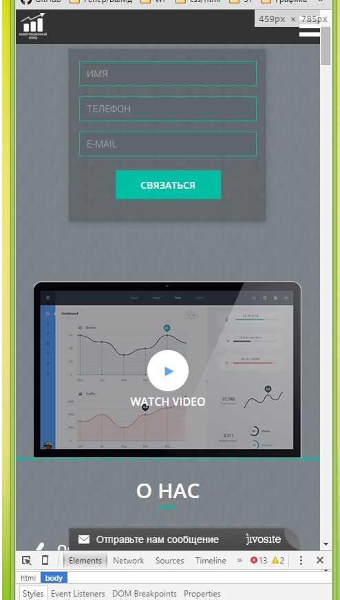
Please tell me with adaptive layout using media queries. In a browser with a width of 460px - everything is displayed perfectly, 
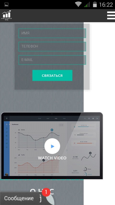
on a phone with a screen resolution of 480px - everything is bad
, this is with standard loading 
, this is when zooming out
Answer the question
In order to leave comments, you need to log in
in the copper request, specify not just max-width, but max-device-width
and see what viewport you have:
<meta name="viewport" content="width=device-width, minimum-scale=1.0, maximum-scale=1.0"><meta name="viewport" content="width=device-width, initial-scale=1.0">Try this: media (max-width:480px) {
input {
width: 100%;
-webkit-box-sizing: border-box;
-moz-box-sizing: border-box;
box-sizing: border-box;
}
}
Didn't find what you were looking for?
Ask your questionAsk a Question
731 491 924 answers to any question