Answer the question
In order to leave comments, you need to log in
Adaptive. How to lay out such blocks?
Hello. 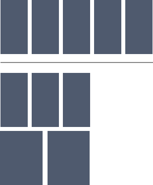
I'm interested in the last two cards in the responsive example, how would it be correct to change their width?
While I see options:
1. Set pre-prepared classes for the last two cards and prescribe these classes in the required media queries.
2. :nth-child
What other options are there?
Answer the question
In order to leave comments, you need to log in
well, you can also use some bootstrap, there will be something like this:
<div class='container'>
    <div class='row'>
        <div class='col-xs-4 col-md-2'></div>
        <div class='col-xs-4 col-md-2'></div>
        <div class='col-xs-4 col-md-2'></div>
        <div class='col-xs-6 col-md-2'></div>
         <div class='col-xs-6 col-md-2'></div>
     </div>
</div>Didn't find what you were looking for?
Ask your questionAsk a Question
731 491 924 answers to any question