Answer the question
In order to leave comments, you need to log in
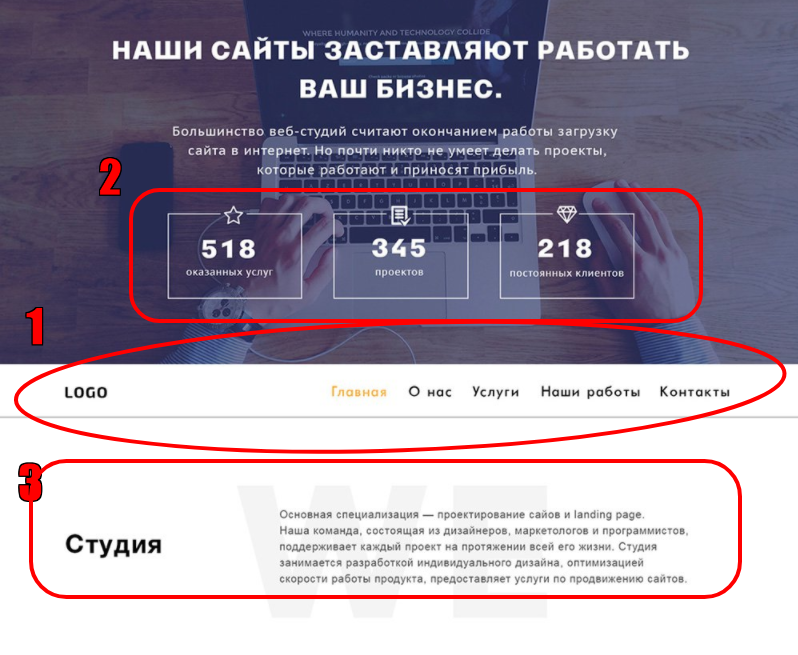
A couple of questions. How to make a navigator using flex?
I need to repeat the psd site, but not everything works out for me. It is necessary to make the navigator through flex, but my justify-content puts the text vertically. On the screen under the number 1 it should look like this.
Next question. How to make these 3 tables in the same arrangement? They have merged into one at the very top, but I can’t do it the way it is under the number 2. This is also via flex.
And the last question. How to position the text under the number 3 in the same way? It only keeps me at the top, only "Studio" comes out in the middle. Also flex.
Thanks in advance.
<body>

    <header class="">
        <div class="main">
            <img class="" src="../img/8379fbcfa44cd4323daa88f3fb01d2db.png" alt="фото">
            <div class="tel">
                <p>+7(981)314364</p>
            </div>
            <h1 class="main h1">Наши сайты заставляют работать Ваш бизнес</h1>
            <p class="main p1">Большинство веб-студий считаю окончанием работы загрузку сайта в интернет. Но почти никто не умеет делать проекты, которые работают и приносят прибыль.</p>
            <div class="t">
                <div class="t1">
                    <h2>518</h2>
                    <p>оказанных услуг</p>
                </div>
                <div class="t2">
                    <h2>345</h2>
                    <p>проектов</p>
                </div>
                <div class="t3">
                    <h2>218</h2>
                    <p>постоянных клиентов</p>
                </div>
            </div>
        </div>
        <nav class="nv">
            <div class="">
                <div class="logo1">logo</div>
                <a class="g1" href="">Главная</a>
                <a href="">О нас</a>
                <a href="">Услуги</a>
                <a href="">Наши работ</a>
                <a href="">Контакты</a>
            </div>
        </nav>
    </header>

    <div class="glav">
        <h2>Студия</h2>
        <p>Основная специализация — проектирование сайтов и landing page.
            Наша команда, состоящая из дизайнеров, маркетологов и программистов,
            поддерживает каждый проект на протяжении всей его жизни. Студия
            занимается разработкой индивидуального дизайна, оптимизацией
            скорости работы продукта, предоставляет услуги по продвижению сайтов.</p>
    </div>


    <footer>

    </footer>
</body>
body {
background-color: white;
font-family: Verdana, Geneva, Tahoma, sans-serif;
margin: 0px;
}
.main {
width: 100%;
height: 100%;
position: relative;
display: flex;
justify-content: center;
color: white;
line-height: 3.5rem;
}
.h1 {
width: 55%;
height: 55%;
position: absolute;
display: inherit;
align-items: center;
font-size: 50px;
text-align: center;
flex-wrap: wrap;
}
.p1 {
width: 55%;
height: 85%;
position: absolute;
display: inherit;
align-items: center;
font-size: 30px;
text-align: center;
flex-wrap: wrap;
}
.tel {
color: orange;
display: flex;
width: 100%;
justify-content: flex-end;
position: absolute;
font-size: 40px;
font-weight: bold;
margin-right: 100px;
}
.t {
width: 100%;
height: 100%;
position: absolute;
display: flex;
flex-wrap: wrap;
justify-content: space-evenly;
align-items: baseline;
line-height: 1.5rem;
}
.t1 {
position: absolute;
display: inherit;
width: 10%;
padding: 5px;
border: 2px solid;
border-color: rgba(255, 255, 255, 0.5);
text-align: center;
font-weight: bold;
}
.t2 {
position: absolute;
display: inherit;
padding: 5px;
border: 2px solid;
border-color: rgba(255, 255, 255, 0.5);
font-weight: bold;
}
.t3 {
position: absolute;
display: inherit;
padding: 5px;
border: 2px solid;
border-color: rgba(255, 255, 255, 0.5);
font-weight: bold;
}
.nv {
width: 100%;
display: flex;
flex-direction: row-reverse;
border-bottom: 5px solid gray;
border-top: 5px solid gray;
font-size: 25px;
font-weight: bold;
}
.nv a {
width: 100%;
display: flex;
justify-content: space-evenly;
color: black;
text-align: center;
padding: 14px 16px;
text-decoration: none;
}
.g1 {
color: orange;
}
.logo1 {
display: flex;
position: absolute;
justify-content: flex-start;
float: left;
}
.glav {
width: 100%;
height: 100%;
background-image: url(../img/WE.png);
position: absolute;
display: flex;
justify-content: space-around;
align-content: flex-end;
text-align: left;
}
.glav h2 {
width: 33%;
height: inherit;
display: flex;
font-size: 30px;
text-align: center;
}
.glav p {
width: 33%;
height: inherit;
float: left;
display: flex;
flex-wrap: wrap;
font-size: 20px;
}Answer the question
In order to leave comments, you need to log in
There is no need to give the elements absolute positioning, with the exception of the icons. Why is the logo flex? Floats are also not needed. Feeling - that the code is simply copied from Figma.
It is more correct to type the menu with the ul list and set the elements to inline flex or flex.
<nav class="nv">
          <div class="logo1">logo</div>
          <ul class="menu">
              <li><a class="g1" href="">Главная</a></li>
              <li><a href="">О нас</a></li>
              <li><a href="">Услуги</a></li>
              <li><a href="">Наши работ</a></li>
              <li><a href="">Контакты</a></li>
          </ul>
</nav>
.nv {
display: flex;
align-items:center;
justify-content: space-between;
}
.menu{
margin:0;
}
.menu li{
list-style:none;
display:inline-flex;
}Didn't find what you were looking for?
Ask your questionAsk a Question
731 491 924 answers to any question