Answer the question
In order to leave comments, you need to log in
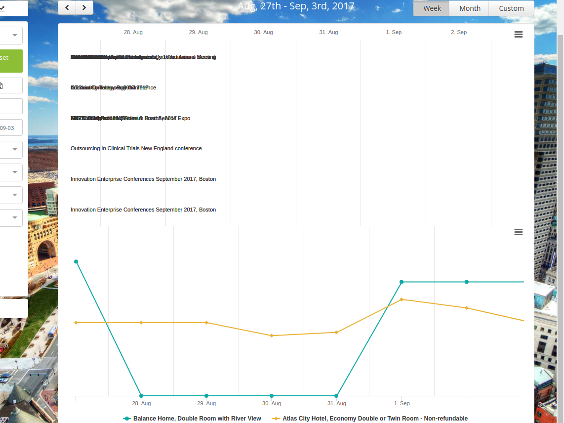
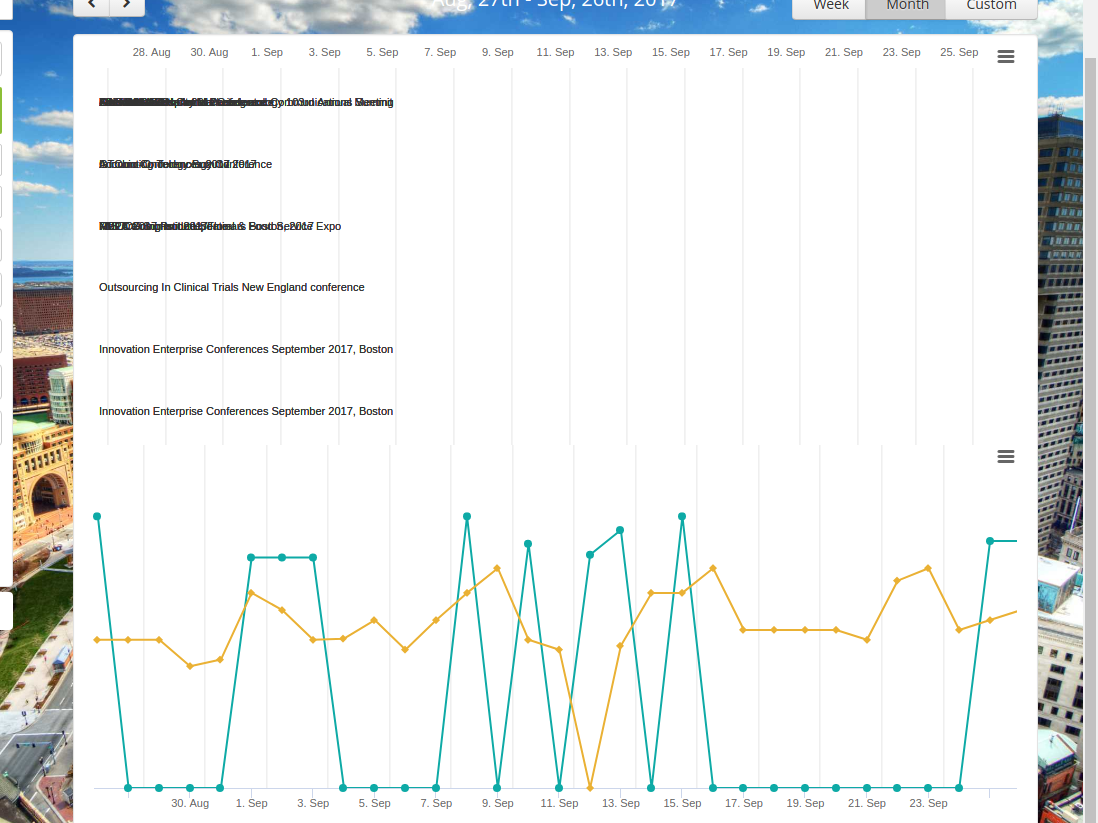
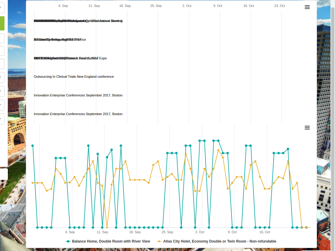
How to align 2 charts in ReactHighcharts?
Purpose: To plot two graphs, one of type line, the other of type columnrange.
Two objects come from the server. In one data for line, in the other for columnrange.
Here are the object configs:
let eventsChartOpts = {
      chart: {
        type: 'columnrange',
        inverted: true,
        renderTo:'eventsChart',
        spacingTop: 0,
        spacingBottom: 0,
      credits: {
        enabled: false
      },

      legend: {
        enabled: false
      },

      plotOptions: {
        series: {
          borderRadius: 3,
          dataLabels: {
            align: 'left',
            enabled: true,
            inside: true,
            formatter: function() {
              if (!this.key)
                return null;
              return this.key;
            },
            padding: 5,
            style: {
              fontWeight: 'normal',
              overflow: 'hidden',
              textOverflow: 'ellipsis',
              textShadow: 'none',
              whiteSpace: 'nowrap'
            },
            useHTML: true
          }
        }
      },
      series:events,
      title: {
        text: null
      },
      tooltip: {
        enabled: false
      },
      xAxis: {
        visible: false
      },
      yAxis: {
        min: moment(dates[1]).unix()*1000,
        max: moment(dates[dates.length-1]).unix()*1000,
        minTickInterval: 24 * 60 * 60 * 1000, // one day
        opposite: true,
        showFirstLabel: false,
        showLastLabel: false,
        title: {
          text: null
         },
        type:'datetime'
      },
};let config = {
chart:{
type: 'line',
renderTo: 'seriesChart',
spacingTop: 0,
spacingBottom: 0,
},
credits: {
enabled: false
},
colors:['#0eaaa6', '#eab134', '#068b85', '#333333','#213837', '#ea3d36', '#067670',
'#132120', '#05635e', '#adc8c7', '#96adac', '#c6e4e3'],
title: {
text: null
},
xAxis: {
crosshair: {
color: '#e3e3e3',
snap: true
},
gridLineWidth: 1,
labels: {
align: 'center'
},
min: moment(dates[0]).unix()*1000,
max: moment(dates[dates.length-1]).unix()*1000,
minTickInterval: 24 * 60 * 60 * 1000, // one day
showFirstLabel: false,
showLastLabel: false,
title: {
text: null
},
type: 'datetime'
},
yAxis: {
maxPadding: 0.1,
reversed: false,
visible: false
},
series:rates
};
Answer the question
In order to leave comments, you need to log in
Didn't find what you were looking for?
Ask your questionAsk a Question
731 491 924 answers to any question